You are chatting with Alicia, an Apple Expert
Hi, my name is Alicia. Welcome to Apple!
You: Hi - I am considering a MacBook Pro.
Alicia: Hi!
Alicia: Ok
Alicia: How can I help?
You: Wondering if there are any plans for a Boxing Day Sale price in Canada?
Alicia: We do not have sales for Boxing Day in Canada. I'm sorry.
You: Oh! Boxing Day is my birthday! Can you offer me any special deals?
You: :)
Alicia: If I had any promo codes, i sure would!
Alicia: But I don't.
Alicia: I'm sorry!
You: Where might I get a special promo code from?
Alicia: We don't have them right now.
Alicia: That space is for when we have any (like shipping codes).
You: When do you have them? When is the best time to buy a Mac?
Alicia: It is very rare that we ever have them.
You: I bet you have them on Black Friday? Why not on Boxing Day for Canadians?
Alicia: This chat service is here to help with the Apple Online Store. How may I help with your shopping?
You: I have the items in my cart and I'm having trouble hitting the buy button...
Alicia: Ok. What seems to be the issue then?
You: It costs too much. A little seasonal goodwill from Apple would help.
Alicia: I'm sorry. If I had any promo codes to offer, I would offer them to you. Apple is known to be a company with little to no sales.
You: Well you may have just lost a customer. I think I'll buy an ASUS for $1000 less.
Alicia: That's fine. keep in mind, their quality is not the same as ours. It won't last you half as long either.
Alicia: If that's what you choose.
You: I don't think that you can qualify that statement. A friend of mine (loyal Apple customer) told me to buy the AppleCare warranty because he has ALWAYS needed it.
Alicia: Well, his situation might be different. I'm not going to argue with you.
Alicia: I don't have any discounts or promo codes to offer you.
Alicia: Is there anything else today?
You: I didn't come here to bash Apple. I want to buy one but I'm not getting a warm and fuzzy that would make me a happy customer. I will have to think about it some more... Thank you for your time.
Alicia: Well you are asking me to give you something that I simply do not have. If I did, I totally would. But you thinking that I do and just won't give it to you.
You: If you threw in a free 1 year One-to-One membership or something like that, I think I would buy it today. All I want is a little good will or flexibility.
You: But it sounds like your hands are tied.
Alicia: My hands are tied. I have absolutely nothing I can "throw in" or any promo codes I can even offer. If I did, it would be no problem giving it to you!
You: OK. Bye Apple.
Alicia: Thank you for visiting the Apple Store. We appreciate your business. If you would like more help, please chat with us again.
Thank you for choosing the Apple Store. If you have any additional questions, please chat us again.
Monday, 19 December 2011
Wednesday, 23 November 2011
Layout strategies for iPhone & Android, Portrait & Landscape, Web App and installed App
Tactile Mobile apps are where it's at - they've revolutionized the user experience to become so intuitive that even babies claw at their parent's phones to make the pretty lights move with their fingers.
We are no longer talking about clicking, double-clicking and dragging, but about tapping, holding, pinching and swiping.
With this revolution come certain expectations. I now expect an immediate response to my gestures and to have the phone sense when I turn it and adjust accordingly.
This post is about how to meet the user's expectations around resizing when developing HTML5 in the mobile browser.
"But isn't that the browser's job to layout my app properly no matter which way the phone is turned?" I hear you ask.
No. Unless your web app is really just a web page with no special layout restrictions, you are mistaken to think that the browser will do this for you with no effort on your part.
First of all, play with your phone's browser a little to understand what it does with a regular web page. Don't get caught in that 'false security zone' which makes your brain think that it's so intuitive that it always knows what it's doing. After a few minutes you'll probably be surprized at what you thought you knew.
One common scenario is that the browser zooms out to a predetermined width by default, making the page elements look very small and sometimes illegible. This is great when you're browsing the web, but not what you want when displaying a web app UI. So the first thing you should know is that there are special HTML5 mobile directives which tell the mobile browser how to present your web page.
I won't go into that here, there are plenty of references on the internet, like this one:
http://learnthemobileweb.com/2009/07/mobile-meta-tags/
However, I will tell you that what you probably want is this configuration:
<meta name="MobileOptimized" content="width" ><meta name="HandheldFriendly" content="true"><meta name="viewport" content="width=device-width, user-scalable=no, initial-scale=1.0, maximum-scale=1.0, minimum-scale=1.0">
This will encourage the phone to size your page to the width of the device, disable the ability to pinch-zoom the page content, and prevent the browser from scaling your content when rotating the phone.
But what about more complex layouts?
A common goal for mobiles apps is the iPod interface layout on the iPhone: A header bar along the top with back and forward buttons either side of the title, a toolbar with icons along the bottom and a scrollable area in the middle showing a list of things (Artists/Tracks/Genres, etc).

One of the fundamental differences with browsers compared to application layouts is that fixed height layouts are hard to implement. The idea being that if you constrain the width the content must be shown and should therefore flow down. Doing fixed height layouts on browsers has often been a challenge. On mobile, the challenge has been further complicated by the fact that internal scroll areas have encountered problems. (iPhone has only in iOS 5 started supporting scrollable divs.) Widgets like iScroll have emerged to try to give web apps the ability to mimic native layouts. However, as I have discussed in previous posts, Android has some serious issues in this area.
However, let's suppose that in an ideal world (i.e. on an iPhone) the center panel scrolls smoothly. What hurdles do we have to leap to support device rotation in the browser?
In essence, assuming the top toolbar stays in place, there are two main things to do: size the central scroll view and position the navbar at the bottom.
This turned out to be a lot harder to implement on Android than on the iPhone.
I came up with a strategy to determine the available screen dimensions and divide up the UI into its proportional parts: status bar, toolbar, content area and navbar. I could then determine the dimensions for each based on the device type and orientation.
Cross-platform (in)compatibility
Things were pretty straight-forward on the iPhone. My strategy seemed sound. The browser did what it was supposed to do and soon I was rotating the device and seeing the layout adjust accordingly. The theory was that this would 'just work' on Android. How wrong I was.
The two main things that made this difficult on Android were:
I soon discovered that the Android browser did not report the physical screen dimensions correctly.
Using jQuery Mobile, Android was also challenged in reporting what mode it was in: landscape or portrait. In fact, much of the time it was opposite to what was reported on iPhone! I discovered that the orientation change was fired from the resize event, and so ended up just working it out from the browser's resize event instead.
To resolve the first issue on Android, I used the bottom css property to compensate for the fact that it could not tell me the dimensions of its own screen. Fortunately this worked, or I would have been really stumped. Ironically, the same approach didn't work on iOS, so I needed to handle each platform differently.
A further issue with the Android resize event is that it gets triggered when the keyboard is up, and reports the new dimensions of the area displayed above the keyboard. And on certain devices, the available height is now less than the available width, which makes the code think it's in landscape mode! What's more, the navbar is repositioned just above the keyboard, since that is now, temporarily the bottom of the webpage... Grief like this makes you wonder if it's worth it!
iOS Standalone Mode
On iPhone, you can save a web app to the Home screen. You will want to tell the iPhone that your app supports this mode using this directive in your HTML page's head section:
<meta name="apple-mobile-web-app-capable" content="yes"/>
You can even define a custom home page icon and loading image:
<link rel="apple-touch-icon-precomposed" sizes="114x114" href="images/icon-114.png" /><link rel="apple-touch-icon-precomposed" href="images/icon-57.png" /><link rel="apple-touch-startup-image" media="mobile" href="images/fl_startup.png" />
This is awesome for mobile web developers who don't need the App Store. This mode gives a less cluttered interface to the user, and makes the app feel more like a native app than a webapp. The address bar no longer is accessible, and the web browser's toolbar is gone. :)
In javascript, Apple provides a special flag to determine the mode you're in:
window.navigator.standalone
You can use this to help when laying out code to determine whether the web toolbar is taking up space.
Supporting high resolution displays
Here's an example of how to use a high resolution image on wide or high pixel density devices:
@media only screen and (-webkit-min-device-pixel-ratio: 1.5),only screen and (min-resolution: 240dpi) {.ui-icon-spinner {background-image: url(../images/spinner@2x.gif);}.ui-icon-spinner {-webkit-background-size: 16px 16px;background-size: 16px 16px;}}
CSS Only Solutions
This is a bit beyond the scope of this article, but there's a school of thought that CSS3 media queries can be used to cater for 90% of the situations without 'resorting' to code. The irony is that the media queries themselves are quite 'code-like' in their formulation, and so it's really just a case of picking your poison.
However, the possibility exists to do some great things with layout on different sized devices using CSS3 queries. A classic example is to define a layout which stacks layout blocks vertically for small devices, but horizontally for larger devices like tablets and desktop browsers. One can even hide certain elements when available screen space is at a premium.
Wednesday, 16 November 2011
I am Android - for we are many...
A picture of health? In this case green is healthy and iPhone is in excellent health compared to Android which is red and burning hot with a fever.
I think this pretty much sums up my statement in the last post that Android is not a platform but really a minefield of similar but significantly different devices derived from a common base.
This is based on research published in a blog post by Michael Degusta.
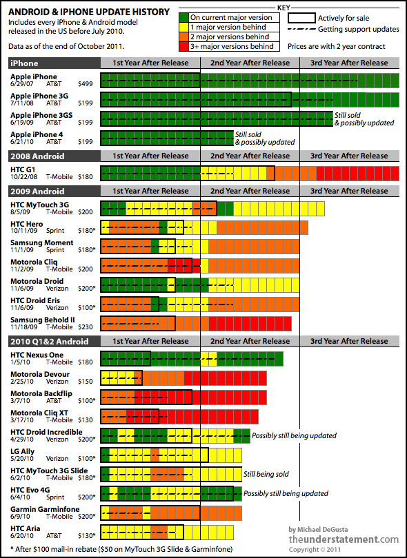
This picture is like a burning fire which should have the effect of warning developers to stay away!
And the best supported phone on this chart is the HTC Nexus One. But it's the end of the line for the Nexus - "it's just 'too old' for the new software". (Link to news article.)
(Thanks to Wazoo for pointing this out to me - and for quoting my blog!)
Tuesday, 15 November 2011
This is not the Droid we are looking for!
My previous post indicated that I had frustrations with Android.
Back to Android. Android is assumed to be a direct competitor to the iPhone and somewhat on par with it. At least it's marketed that way, and I would say perceived that way, by many.
I will tell you why.
But first of all let me congratulate Steve Jobs & co for raising our expectations so high! The iPhone really is a product that deserves its place in the history books of technological advancement. It really does deliver exceptionally well on all fronts - including its excellent embedded browser. It is a shining example of standards support and best-in-class implementation. Steve Jobs had a theory that user experience should drive your business. With the iPhone he realized his vision and exceeded my expectations.
Back to Android. Android is assumed to be a direct competitor to the iPhone and somewhat on par with it. At least it's marketed that way, and I would say perceived that way, by many.
The reality is a very different story. The difference is that where iPhone controls the hardware of their platform and is therefore working from a common hardware base, Android is an open architecture. The Android software is available for all the wannabe hardware manufacturers to base their software build on. Each manufacturer puts a different hardware configuration together and tweaks the basic software to work with their hardware. For competitive advantage, some manufacturers will also tweak the browser software and other components to their own whim. So when a phone says it is Android 2.2, it will not necessarily work the same as another 2.2 phone. There will be differences. Not all 'droids are created equal.
To compound the problem, the carriers will also want specifics for their own purposes. For example, custom apps bundled in to the base build to be pre-installed on the phone.
Furthermore, where it falls apart is in the software landscape. How do you get a software update for your phone? From the provider. Who releases the build? The manufacturer through the provider. So now the manufacturer is a software development house. They have branched the code for all their devices, and are stuck with supporting them. They not only have specific builds for each of their hardware configurations, but also have to customize that build to satisfy the demands of the network providers. And it's not in their best interests to be caught in a support cycle. There's no revenue in that - the phone has already been sold. They are interested in getting the next product out the door before their competitors do. And as we've seen, getting updates for Android has proven extremely frustrating for end users. Think of all the effort required to put the next great Android release from Google onto an already released phone. Chances are that the effort will be put into the next phone to be bought, not the one that has already been sold.
So how does all this affect the developer?
Well, to deliver on Android we have to contend with many, many different devices, many of which have different software configurations and patches on them. And this assumes that there are no hardware glitches or known issues - a very naive assumption when you realize that most of these products have been rushed into a highly competitive market.
Steve Jobs actually addressed this situation in what is called his 'Google rant'. I just think he was trying to expose the truth and help Google to see that they were going down a path that would induce pain on all fronts. You could see this as an arrogant 'told you so' rant, but I see it as a fair warning and glad you told us.
So taking all this into consideration, as a software architect you might look for ways to alleviate the pain. No development shop wants to manage any more code branches than they have to.
As an architect, you would not be at all blamed for following this line of thought: Android is not really a standard, but a myriad of very similar, but significantly different products. I need a common platform to deliver on. Is there an alternative?
Hang on, isn't that excellent HTML5 compliant iPhone browser based on webkit? Yeah - it's actually called Mobile Safari. Isn't Google Chrome based on webkit too? That browser on the Android phone is also webkit-based and HTML5 compliant. It must be Mobile Chrome. Why don't we build our apps to web standards instead? I've heard you can do some really nifty animation effects with CSS3... this could be just what I'm looking for, and it actually might be a lot of fun!
STOP RIGHT THERE!
Time for a reality check (or two)! (Remember that I'm biased towards creating cross-platform HTML5 mobile apps, so I'll talk a lot about the browser.)
- Reality check #1: The current Android browser is not Mobile Chrome. Remember - Google bought Android, they didn't make it. It may pass the HTML5 compliance tests, but that does not mean to say it does it well. My experience with the Android browser is that it's glitchy, inconsistent across devices and rough around the edges. For example, its rendering of CSS3 rounded corners is noticeably jaggy, and positioning of elements is often off by a pixel creating gaps where there should be none. (My suspicion is that Google are frantically re-implementing the Android browser to become the Mobile Chrome many think it is.)
- Reality check #2: All Androids (and their browsers) are NOT created equal. Manufacturers tweak the browser code too for their own purposes.
- Reality check #3: There are also certain commercial, political and legal reasons why things are different on different Android devices. Don't believe me? Load up Google maps in the Android browser and try doing pinch to zoom on a 2.x HTC phone. Now try the same on a Samsung phone. The difference? HTC does not want to impinge on multi-touch patents, hence no pinch to zoom in the browser. (Samsung supports pinch-to-zoom. But they had to withdraw some devices in some countries because of patent infringement. Could there be a link?)
- Reality check #4: Just because it's got it, doesn't mean to say it flaunts it. Android devices have some of the most impressive hardware specs around. Multi-core processors, GPUs & gobs of memory. However, try panning Bing Map in the Android browser. Then try it on an iPhone. The difference: Android does not implement hardware acceleration in the browser rendering of elements, and it shows.
- Reality check #5: Even though it's in the best interests of Google to improve Android fast (to live up to the expectations of its customers and become a truly viable competitor), this does nothing to rectify the myriad of broken/deficient devices that are already out there. And even when they do fix the Android reference build, how will they enforce standards on an 'open' community who will continue to tweak the core to meet their own agendas?
In short, if you were expecting Android to be a platform you could deliver on, be ready for a reality check. You might have been looking to extend your application to other devices, and assumed that Android was a platform just like iOS. However: "This is not the Droid we were looking for!"
Welcome to the minefield that is Android. To mis-quote a biblical verse: "I am Android, for we are many."
Tuesday, 27 September 2011
The Reality of Mobile Web Development
I'm just coming out of the other end of our mobile web project. What an interesting, and sometimes frustrating ride!
As I have time, I'll go into details in other posts, including:
Here are some conclusions:
- jQuery Mobile is now at release candidate 2
- iPhone rocks on the mobile web
- Android browser is deficient
- Blackberry is seriously deficient - don't go there - it'll be stone dead in a moment!
- Windows Mobile - Late out of the gate, initial signs are good, but it's too early to tell
If the promise of cross-platform mobile web applications is going to be fulfilled, standards need to be conformed to, and implementation of those standards must be done well. Android should really be a contender, but they need to get their act together.
The theory of cross platform mobile web development seems sound: both iPhone and Android phones are smart devices with large memory footprints and state of the art processing power. Both have WebKit-based HTML5 compliant browsers. However in the real world they are worlds apart. You see the devil is in the details. In the final analysis, iPhone is a platform and Android is a minefield of different software and hardware configurations based on a core reference implementation. Android is not a platform, so much as a legion of platforms built out of similar materials.
It's PC vs Mac all over again in the mobile space.
As I have time, I'll go into details in other posts, including:
- This is not the Droid we were looking for!
- Layout strategies for iPhone & Android, Portrait & Landscape, Web App and installed App
- Delivering flexibility - versatile deployment strategies
- Optimization & caching techniques
- Integration with Facebook
Wednesday, 16 March 2011
Native vs Hybrid
I read an interesting post reporting on a debate between developing mobile Web Apps vs going Native. This has been a hot topic at work lately, and I'm a big advocate of doing what fits best. I like to keep my options open, and not be forced into a corner. So in many instances, I come down on the side of cross-platform HTML5 WebKit apps.
Whereas some applications are definitely best implemented as native, (arcade style games come to mind as obvious), many business & productivity applications are content driven, and must be connected. Sure we need a slick user experience - and Apple devices have certainly raised the bar in this respect. But in many cases the emphasis from a development point of view should be on cross-platform capability, not device-specific slickness. The quandry is, that this is not really in the best interests of the device manufacturer who has so much more to make than the price of the device if they can just lock you in to their platform.
That said, you can have the best of both worlds with tools & frameworks like WebKit, jQuery Mobile and PhoneGap. WebKit transitions are as good as native, jQuery Mobile promises to give a consistent & performant cross-platform experience (just give it a few more months) and PhoneGap gives you the choice to wrap it all up in a native shell and enhance only the parts of a WebApp that need to be native without having to go completely down the one-way dead-end street of single platform implementation.
Objective-C and Cocoa Touch taught us a lot about how to do mobile right, but now it's time to leave the Apple University and realize that the real world does not revolve solely around Apple.
Thursday, 27 January 2011
jQuery Mobile Alpha Release Impressions
Great discussion!
Unless I am missing something, the best way I have of building a dynamic list right now is to add complete markup using fully formed and styled HTML. The simplified markup you write is not the markup that appears in the page. It gets 'enriched' by the framework. I do not think this is a bad thing at all, but the missing link for dynamic application developers is an equivalent way to do this via Javascript.
The reason that some developers do not encounter this weakness is that they are generating their content on the server and sending it down to the client. This enables the jQM engine to kick in and 'enrich' the markup.
However, when you consider that many developers will want to package their applications up as 'native' apps using tools like PhoneGap, the application at that point must be resident on the device. (This is a significant factor, for various reasons - not least because the Apple AppStore won't accept an app that opens a WebView and points it to a webserver.)
In this case, we NEED a framework that makes it easy to make event-triggered AJAX calls in the background and dynamically update content using Javascript.
At present the best current solution I have yet to come across in jQM is this:
Markup:
Javascript content injection:
Of course, we should not have to delve into the generated page source to find out what jQM has decorated the markup with and add all that js code to emulate it. (Try adding a button! Ouch!) I have read in this thread that the jQM team is exposing a method so that you can basically just do something like this in the next release (see Todd Parker's responses in that thread):
Note that in the example above, I'm adding to the markup at runtime in exactly the same way as I would if authoring the markup at design time. Much more intuitive.
I'd also like to see an additional approach: implement a javascript API of objects and methods that just allow you to append and manipulate the objects programmatically like this:
- var listItem = new ListItem('Fred');
- listItem.icon('images/avatars/avatar_1.png');
- listitem.iconSize=small; //or iconHeight = 16; - you get the idea
- $('#memberlistview').append(listItem);
I can understand that this final suggestion is a tall order, and may be a fairly large addition to the library. Having it as an optional extension for 'client-resident' applications however, would be a great addition to the framework as it matures, IMO.
I see great potential for this framework, but it's definitely a little green behind the gills right now. But as an alpha it's already quite capable. Production ready for dynamic client-resident apps that would pass as native? Not sure about that...still a way to go.
I'll be watching JQuery Mobile with great interest...
Going Mobile
After two years of travelling, with Sun going down on me, and Oracle rising on the horizon without me, I came back to the Calgary market.
It has been an interesting time for web development, with a significant ICEFaces project under my belt, I took another look into the available frameworks and found some satisfaction in ZK. One of the factors being that I needed a solution that could scale into mobile browsers.
Even though ZK is great on the desktop, ZK Mobile was not really what we wanted for the small form factor devices. They need to re-think their mobile strategy. I think the industry in general is trying to adjust to the fact that mobile Java (JME) is fast giving way to the mobile web, and many will be having to take Javascript much more seriously than we did in the past as fully capable WebKit browsers become predominant.
In an effort to rationalize mobile development across multiple platforms, without having to write native apps in each one, I've been looking closely at the new wave of mobile web technologies.
My current focus is on building AJAX apps with jQuery and the new jQuery Mobile framework, and wrapping them in PhoneGap for psuedo-native apps which can be submitted to the AppStore, Android market, etc.
Watch this space for technical hints, tips (and vents) as I negotiate this new landscape.
Subscribe to:
Posts (Atom)